At the threshold of detectability, both the surface of the negative and that of the thing it represents must be studied as both material objects and as media representations. In other words, this condition forces us to remember that the negative is not only an image representing reality, but that it is itself a material thing, simultaneously both representation and presence.
Weizman, Forensic architecture: violence at the threshold of detectability1
introduction
Obtaining comprehensive assessments of the damage in Gaza has been quite difficult, with the occupation having closed Gaza off completely to foreign journalists in the last 15 months of intensified genocide. With some Palestinians now able to return to what remains of their homes, we are starting to obtain pictures of the complete and utter destruction of entire neighborhoods --- pictures reminiscent of the total annihilation caused by American atomic bombs dropped on Japan. The human cost is, of course, unspeakable23.
At the time of writing, however, most analyses still rely largely on satellite data, which is what we will look at below. High resolution visible-spectrum satellite imagery (like that used in Google Maps) is common, though typically not open access. Here we will focus on a less well-known, more technical remote sensing technique known as SAR interferometry, or InSAR, for short. Appropriately enough, InSAR is often used to track large scale environmental changes (land subsidence, volcanic uplift, deforestation and flood monitoring, etc.) in addition to structural damage. As Andreas Malm reminds us: the destruction of Palestine is the destruction of the Earth4.
InSAR, when combined with building footprint data, can be used to create
damage proxy maps like this one by Van Den Hoek and
Scher:
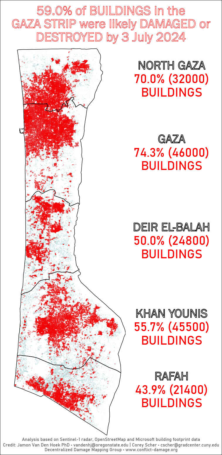 This damage map was
constructed by the Decentralized Damage Mapping
Group using Sentinel-1 radar imagery,
together with various sources of building footprint data.
This damage map was
constructed by the Decentralized Damage Mapping
Group using Sentinel-1 radar imagery,
together with various sources of building footprint data.
The methodology behind these maps is described, for example, in the
paper5. Maps constructed using InSAR are used in
the media and, to my surprise, surprisingly straightforward to construct
using open-access data and free-to-use InSAR processing pipelines made
available by NASA. In these notes, we'll learn a bit about the
technique underpinning these damage estimates, known as coherent change
detection, and make our own proxy damage map of Gaza (using
python). Of course, constructing maps that are accurate
is another story: this requires a thorough knowledge of the
technicalities of InSAR as well as an understanding of how these
technicalities interact with the dynamics of airstrikes targeting dense
urban centers and refugee camps.
We'll start in the next section with a very brief introduction to SAR imaging. I've distilled this section from the very approachable NASA ARSET course "Basics of Synthetic Aperture Radar (SAR)"6, the slightly more advanced SAR handbook7, as well as chapter 1 of 8, which contains some of the mathematical details at a basic level.
A word of warning before we begin. I am not an expert: my background is in mathematical physics and data science, and this is my first foray into remote sensing. As such, corrections or suggestions are greatly appreciated.
synthetic aperture radar
Unlike visual-spectrum photography, which passively collects incoming light, synthetic aperture radar (SAR) is an active remote sensing technique. Satellites equipped with SAR transmit short bursts of microwave-frequency electromagnetic radiation (radar) focused by an antenna into a beam. The beam hits the surface of the earth and reflects off, backscatters, in various ways, as the image below shows.
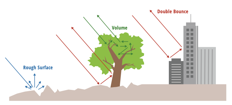 Radar backscatter is sensitively dependent on a number of
different variables, but for urban landscapes, these patterns are good
to keep in mind.
Radar backscatter is sensitively dependent on a number of
different variables, but for urban landscapes, these patterns are good
to keep in mind.
The precise way in which the radar scatters is highly dependent on a large number of variables: the incidence angle of the beam, the difference between the radar wavelength and the size of the objects being imaged, moisture content of the soil, etc. Intuitively the satellite can only detect backscatter that bounces back towards itself. A surface that is very smooth relative to the radar wavelength, for example, will appear very dark in the resulting image because the beam will bounce almost entirely away from the satellite. An area with smooth surfaces perpendicular to the smooth ground (e.g. buildings in an urban environment) on the other hand are often very bright due to the phenomenon of "double bounce" pictured above.
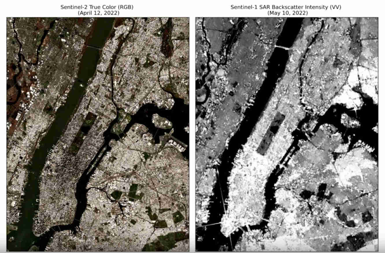 Even though the SAR image is not capturing visible light,
the result is still recognizable due to the consistent backscatter
patterns.
Even though the SAR image is not capturing visible light,
the result is still recognizable due to the consistent backscatter
patterns.
Clearly, then, SAR imaging produces results quite different than usual photography and requires some expertise to interpret. Radar does have its benefits though. For one thing, it's useful even at night. Moreover, weather is no obstacle, which is quite significant given that about 55% of land tends to be covered by clouds depending on the season9. And in fact the way radar interacts with different materials, water, and vegetation means that it can exploited to capture information that would otherwise be obscured in photographs. This explains its utility in many ecological applications.
So much for the R in SAR, but what does the descriptor "synthetic aperture" mean? Actually, before we tackle this question, let's take a look at the geometry of SAR imaging:
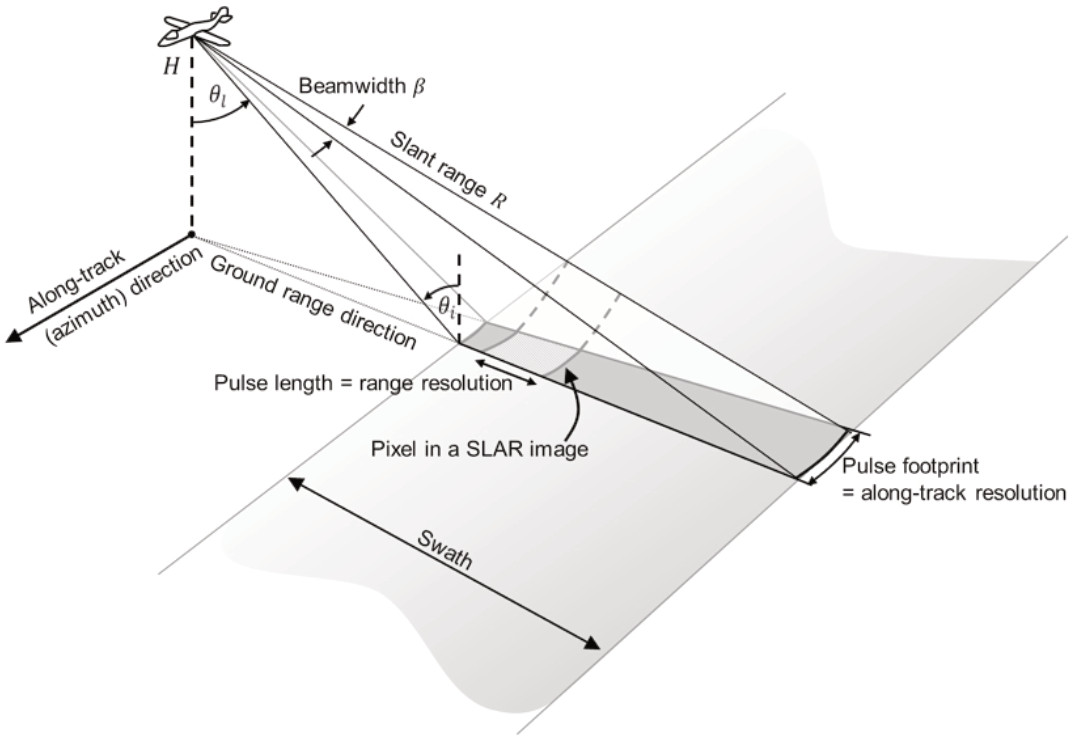 (taken from Chapter 2 of the SAR handbook)
There's a lot going on here, but I just want to focus on a few points. The first is the acronym SLAR, Side-Looking Airborne Radar, which is pretty self-explanatory: the radar beam is sent out of the aircraft or satellite perpendicular to the direction of travel (the ground range direction is perpendicular to the along-track direction). Side-looking is necessary for imaging because radar measures distance to a target based on the time of arrival. As the image below demonstrates,
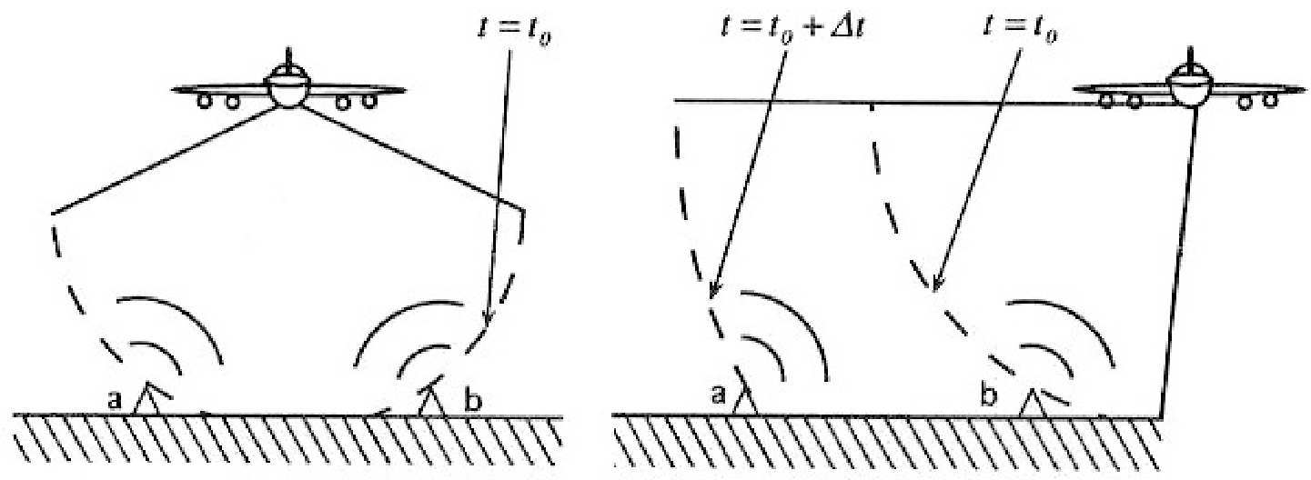 (from a NASA ARSET training)
down-looking radar would not be able to distinguish between the equidistant points a and b because the backscattered radar would reach the antenna simultaneously.10
Another thing to notice is that the geometry of SAR imaging has its own idiosyncracies. Similar to how we lose some depth perception when taking a photo from directly from above, side-looking can introduce its own geometric distortions:
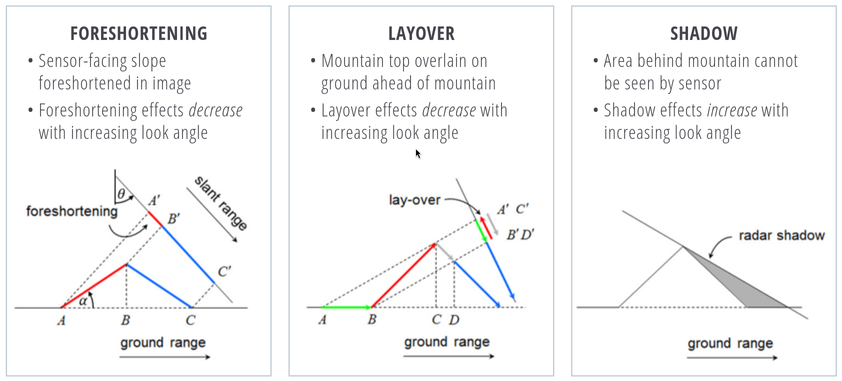 (taken from Chapter 2 of the SAR handbook)
The first two distortions depicted above are typically corrected for (sometimes multiple vantage points of the same can help determine the necessary topographical considerations) while the last is often just treated as missing data (or imputed via interpolation). In addition to geometric distortion, SAR images are characterized by a "salt-and-pepper" noise grain called speckle, which can be seen in the image of New York City, above. Speckle is an unavoidable part of SAR imaging, arising from the chaotic backscatter due to subpixel details (say, individual blades of grass). Speckle can be smoothed out, but smoothing comes at the cost of resolution loss.11
Interestingly, unlike in standard photography, the imaging resolution in the ground range direction increases with distance from the aircraft (see equation 2.3 of 7). We're not so lucky in the along-track direction, however, in which the resolution falls linearly as the altitude of the aircraft increases. This would seem to make satellite-based SAR imaging impractical, especially since the resolution scales with antenna length, which must be kept small for a feasible space mission. The solution comes in the form of the aperture synthesis principle which imitates a much longer antenna by taking a sequence of images in succession as the spacecraft moves in the along-track direction and applying some clever mathematical postprocessing.12 Remarkably, using aperture synthesis yields an along-track resolution that is independent of the aircraft altitude (see equation 1.5-7 of 8)13.
sentinel-1
The satellite whose data that we will be working with here is the Sentinel-114,
Sentinel-1 works in a pre-programmed operation mode to avoid conflicts and to produce a consistent long-term data archive built for applications based on long time series.
Sentinel-1 is the first of the five missions that ESA developed for the Copernicus initiative. Its measurement domain covers landscape topography, multi-purpose imagery (land), multi-purpose imagery (ocean), ocean surface winds, ocean topography/currents, ocean wave height and spectrum, sea ice cover, edge and thickness, snow cover, edge and depth, soil moisture and vegetation.
The Sentinel-1 mission actually consisted of two satellites, Sentinel-1A and Sentinel-1B, but the latter ceased to function correctly in December of 2021. Sentinel-1C was just recently launched in December of 2024, and there is also a Sentinel-1D in the works. Sentinel-1's orbit is cyclic, as seen in the image below, with a repeat period of 12 days (it would have been 6 were Sentinel-1B still functioning). This means that the satellite returns to approximately the exact same spot (relative to the Earth) every 12 days.15 Returning close to the same point repeatedly is crucial to be able to do SAR interferometry, as we'll see below.
The Sentinel-1 satellite uses a C-band radar, which corresponds to a wavelength of about 5.55cm. The SAR images taken over land, according to documentation, are typically made available for access "in practice... a few hours from sensing". This band is versatile in that its radar imagery can be used for "land subsidence and structural damage", "geohazard, mining, geology and city planning through subsidence risk assessment", "tracking oil spills", "maritime monitoring", "agriculture, forestry, and land cover classification". There seems to be a particular emphasis (both in the documentation and in the literature) on natural disaster analysis and monitoring. It's maybe not surprising, then, that SAR images are being used more and more to create damage proxy maps for man-made disasters such as war. Mapping damage in a given area requires an imaging of the region both before and during/after the event under study. The damage is then computed as a difference (an interference of radar waves) of the two images. To make this precise, we now turn to SAR interferometry and coherent change detection.
coherent change detection
Radar consists of carefully controlled short bursts of electromagnetic radiation, which we can visualize as waves travelling towards the target, backscattering off in all sorts of directions, with a portion of the waves returning picked up by the satellite antenna16. The strength of the returning waves will, of course, be weaker than the strength of the emitted waves. This signal strength is known as the amplitude of the detected signal, which is typically displayed in SAR images as the brightness of a given pixel. The notion of amplitude is easy to conceptualize as signal strength, but there is another important aspect of waves known as phase, which is mathematically and conceptually more sophisticated. The phase data gathered by a SAR antenna will be the key piece below in detecting damage done to the built environment in Gaza, so it's worth understanding the basic underlying ideas.
Consider a sinusoid (in 1-dimension for simplicity) together with its
shift by theta:
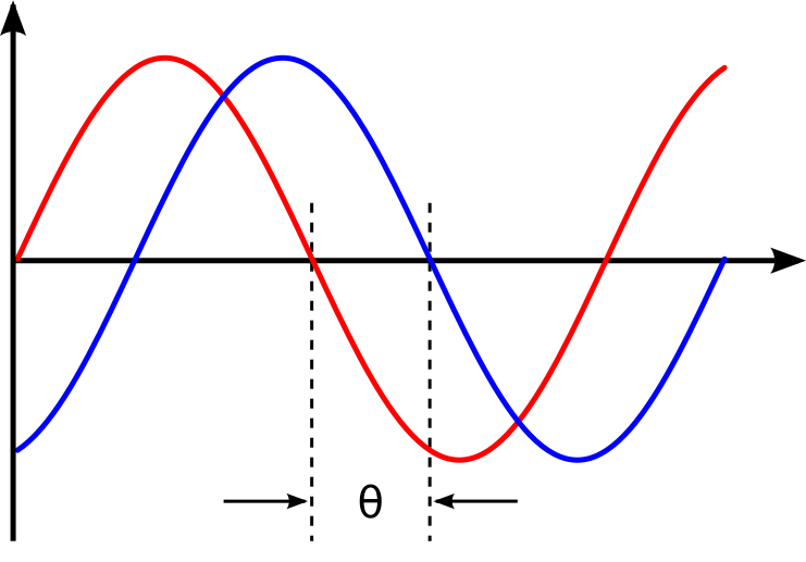 (from Wikipedia)
This offset between the waves is known as a phase shift. We can imagine
the red wave as outbound from the satellite, with the positive x-axis
pointed towards the earth, and the blue wave the incoming backscatter.
Realistically we would expect the blue sinusoid's amplitude (vertical
extent) to be much smaller than the red's, depending on what the
backscatter looked like17. The swath of ground under investigation is
split up -- in the eyes of the satellite's receiver -- into resolution
cells, which we can think of as pixels in the resulting image. From
each resolution cell the sensor reads the amplitude of the backscattered
wave and the phase difference between the outgoing wave and the
backscattered wave. The most convenient way to represent this data is
using complex notation for the sinusoidal signals, Ae^{iw}, where
A is the amplitude and w the phase. To quote the ESA's
guidelines:
Each pixel gives a complex number that carries amplitude and phase information about the microwave field backscattered by all the scatterers (rocks, vegetation, buildings etc.) within the corresponding resolution cell projected on the ground.
To understand the role of the phase difference more concretely, consider
the following example:
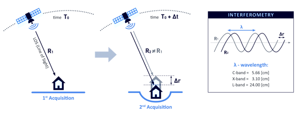 (from the InSAR
product guide)
(from the InSAR
product guide)
Here, on the satellite's second pass, the scatterer under study has subsided into the ground (due to an earthquake, say) and the distance the radar waves travel changes slightly. The resulting backscatter measured by the sensor will be slightly different in the two cases: the number of total oscillations experienced by the radar will be different (by a factor depending on the radar wavelength). The corresponding phases will therefore be different, so comparing these repeat-pass SAR images allows us to detect changes in the scatterers, both via changes in amplitude and phase18. SAR interferometry refers to this general technique of comparing (interfering) two or more SAR images taken of the same swath, from the same vantage point, in order to extract information.
It follows that the complex number (again: amplitude and phase) associated to a given pixel of an InSAR (interferometric SAR) image is sensitively dependent on the details of the objects in that resolution cell. If we were to take two images of the exact same swath -- with the satellite in the exact same position relative to the swath -- at slightly different times, we might find significant differences due to slight movements in trees and grass due to wind. This is an example of what we would call an area with low coherence19. On the other hand, high coherence areas are likely to be buildings or roads, say, at least in an urban environments. To detect building damage, then, we need 3 SAR images: 2 from before the event to isolate areas of high coherence, and 1 from after the event to find areas whose coherence has dropped significantly.
In more detail:
- Choose a time
t_0such thatt_0andt_0+dtare before the event of interest (IOF bombardment of Gaza). Heredtis the repeat-pass look time, 12 days in the case of Sentinel-1. - Use the images taken at
t_0andt_0+dtto generate a coherence image, call itG_1. Isolate the regions of high coherence. These regions -- at least in urban settings -- are likely to represent the built environment, and are what we're interested in when attempting to determine building damage. - Use the images taken at
t_0+dtandt_0+2dtto generate another coherence image, call itG_2. This time interval spans the event under investigation. - Denote by
Rthe the high-coherence region in the first coherence imageG_1. Compute the percent change in coherence, restricted toR:(G_2-G_1)/G|_R. We expect decreases in coherence in the previously high-coherence zones to correspond, proportionally, to building damage (see the methods sections of 5).
Let's take a look at how this works in practice by working with freely-available, preprocessed data from the Sentinel-1 satellite (via NASA's Earth Data portal).
downloading InSAR data
The main tool we're going be using to pin down the relevant Sentinel-1 images of the Gaza strip is the Alaska Satellite Facility's data search tool called Vertex. Before we can use Vertex, we need to register for an account on NASA's Earth Data, which can be done here. After completing the registration, open up Vertex and hit the "Sign In" button at the top right. There is an EULA to agree to, but after that we're good to go.
Vertex is a web-based UI20 that we can use to search the Sentinel-1 dataset geographically and temporally. Our focus in this note is on Gaza, with the event under investigation being the Zionist bombardment immediately after October 7th, 2023. We can use Vertex to draw a rectangle around the Gaza strip to restrict our attention to. I free-handed a rectangle around Gaza on Vertex, specified in the well-known text (WKT) format by
wkt_gaza = (
    "POLYGON(("
    "34.2173 31.2165,"
    "34.595 31.2165,"
    "34.595 31.5962,"
    "34.2173 31.5962,"
    "34.2173 31.2165"
    "))"
)
We'll need this later when we're analyzing the data in Python. As
outlined above, coherent change detection requires 3 SAR images taken
from the same vantage point21: 2 before the event to isolate the
high-coherence pre-event built environment, and 1 after to measure the
extent of change post-event. Click on the Filters button
and change the start and end date to September 1, 2023 and December 1,
2023. Then, restrict the file type to
L1 Single Look Complex (SLC), as that's the type of SAR
image we're going to use. Hitting the search
button
should now yield a number of rectangles overlaid the map, each of which
intersects non-trivially with our polygon containing Gaza. The list of
scene files on the bottom left corresponds to these rectangles. We
mentioned earlier that Sentinel-1 takes snapshots of the same swath
every 12 days -- we can see this by noting that the scene
...DF80 taken on October 5, 2023 covers more or less the
exact area as the scene ...D1ED taken on September 23, 2023
does. From the scene detail window we can see that both of these scenes
are frame 97 of path/track number 160. This is precisely the sort of
pair of images that we need when doing repeat-pass interferometry.
We'll take ...DF80 as the second of the 2 pre-event
images. To find appropriate images for the remaining 2 images, we can
click on the Baseline button that appears at the bottom of
...DF80's Scene Detail window. This modifies
our search to a baseline-type search, which displays a number of other
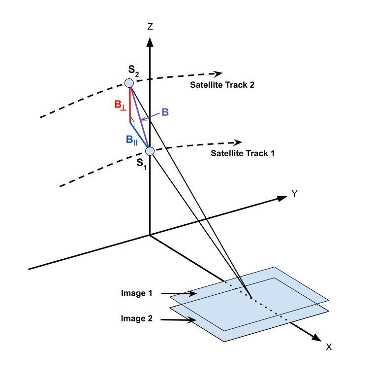
images as points on a scatterplot. This plot is showing us that these
images were taken not only at a different time than our baseline image,
but also at a different position ("perpendicular baseline").
 (from the InSAR product guide)
Ideally the images would be taken at a perpendicular baseline of 0, but
we can see ...62AB (September 11, 2023) and
...D1ED (September 23, 2023) before our October 5th image
at perpendicular baselines of -67 m and -157 m, respectively, and
...6EBF (October 17, 2023) at a tiny perpendicular baseline
of 6 m. We'll take ...6EBF as our post-event image, but we
have two options for our first pre-event image. Now I'm not an InSAR
expert, so I'm not sure how much worse a -157 m baseline is (for
purposes of coherent change detection) than a -67 m baseline. We may as
well run the analysis with both and see if there's any significant
differences.
We can now use Vertex to request ASF to generate the SAR interferometry
data from the pairs of SAR images that we've chosen. Making sure that
the list of scenes is showing 0m and 0d for ...DF80, click
on the on-demand button (shown as three overlapping rectangles to the
right of the Days column) and select
InSAR Gamma followed by Add 1 SLC job for each
of our other images ...62AB, ...D1ED, and
...6EBF. This will add three jobs to our on-demand queue.
Open up the queue details at the top-right of the interface and you
should see a set of processing options, with the 3 jobs listed in the
queue below. Set the LOOKS option to 10X2
(this produces a higher resolution image than the 20X4
option) and check the Water Mask box to make sure we don't
bother processing the water off the coast. We'll leave the rest of the
options as default for now, and submit the jobs. Note that you'll be
given an option to label the batch with a project name to make for
easier retrieval later.
The jobs will take some time to process, and you can view their status
by selecting the On Demand search type and filtering by the
project name. The jobs will show as pending, but once they're done you
can add each of them to your cart and download them. These three
datasets, once unzipped, are a little over 1GB in total.
raster processing
In the following section, I mostly follow Corey Scher's code for the relevant NASA ARSET training, which can be found here.
Now that we have our coherence data on disk, we can apply some do some simple computations to generate coherence change plots. First let's get paths to our data sorted out and load the images into memory.
from pathlib import Path
import re

import geopandas as gpd
import matplotlib.pyplot as plt
import numpy as np
import pandas as pd
import rioxarray
import shapely
import shapely.wkt
import xarray as xr

DATA_PATH = Path.home() / "data/insar/"
data = []
pattern = re.compile(r"(2023\d{4})T.*(2023\d{4})T")
for dir in DATA_PATH.iterdir():
    for p in dir.glob("*corr.tif"):
        matches = pattern.search(p.name)
        if matches is None:
            continue
        gps = matches.groups()
        data.append({"start_date": min(gps), "end_date": max(gps), "path": p})
data = pd.DataFrame(data).sort_values(by="start_date").reset_index(drop=True)
data["start_date"] = pd.to_datetime(data.start_date).dt.date
data["end_date"] = pd.to_datetime(data.end_date).dt.date
data["image"] = data["path"].map(lambda p: xr.open_dataset(p, engine="rasterio"))
We've singled out the files ending in ...corr.tif, as
these are the correlation/coherence raster images (that is, data
arranged as a matrix of cells, in this case pixels). We use the
xarray library and friends to work with rasters. Next,
recall that the processed SAR images we downloaded were significantly
larger than our actual area of interest, which is the Gaza Strip. To cut
away the rest, we'll grab a shapefile for the Gaza strip (I found one
here, but you can
probably look for more official sources.) Actually, the shapefile I have
is for Palestine more generally, and thus includes the West Bank. To
restrict to the Gaza strip we can just intersect with the polygon we
drew in Vertex.
vtx_rect = shapely.wkt.loads(wkt_gaza)
with open(
    DATA_PATH / "palestine-boundaries-data/geoBoundaries-PSE-ADM0_simplified.geojson"
) as f:
    gaza_geom = shapely.from_geojson(f.read()).intersection(vtx_rect)
gaza_strip = gpd.GeoSeries(gaza_geom, crs="EPSG:4326").to_crs(data.image[0].rio.crs)

# clip each of our rasters to restrict to Gaza
data["image"] = data.image.map(lambda r: r.rio.clip(gaza_strip))

fig, axs = plt.subplots(1, 2, figsize=(8, 4), sharey=True)
for i in range(2):
    im = data.image[i].band_data.plot(ax=axs[i], cmap="Greys_r", vmin=0, vmax=1)
    if i == 0:
        im.colorbar.remove()
    axs[i].set_title(f"{data.start_date[i]} to {data.end_date[i]}")
    axs[i].get_xaxis().set_visible(False)
    axs[i].get_yaxis().set_visible(False)
plt.suptitle("Coherence: Gaza strip")
im.colorbar.set_label("Coherence")
plt.tight_layout()
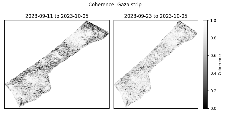
With these numbers in mind, we expect any analysis done with the first image will effectively be assuming a smaller built environment than an analysis using the second image. We could investigate here more thoroughly to choose which is a better pre-event image to use, but for the purposes of this note, I'll just stick with using the image on the right. My guess is that having a 12-day smaller time interval is more important than having a 100m smaller perpendicular baseline.
With all that being said, let's get to the comparison against coherence post-event. We'll compute the percent change in coherence post-event relative to pre-event coherence for both images. The important point to remember is that we're only interested in areas of high coherence pre-event. We also exclude areas whose coherence increased: we're operating under the assumption that damage decreases coherence.
# compute percentage change in coherence
aligned = xr.align(data.image[1], data.image[2])
pre = aligned[0]
post = aligned[1]
change = (post - pre) / pre
# in areas of high-coherence, where it decreased
change = change.where((pre >= 0.9) & (change <= 0))

fig, ax = plt.subplots(1, 1, figsize=(8, 6), sharey=True)
im = change.band_data.plot(ax=ax, vmin=-0.15, vmax=0, levels=5, cmap="Reds_r")
ax.get_xaxis().set_visible(False)
ax.get_yaxis().set_visible(False)
ax.set_title("Change in coherence: Gaza strip\nOctober 17, 2023")
im.colorbar.set_label("Coherence change (%)")
plt.tight_layout()
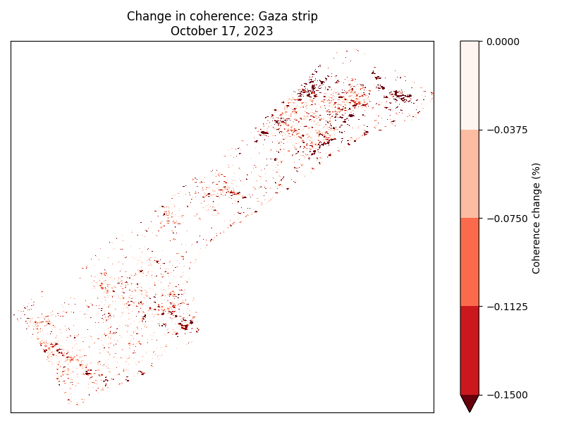
The darker areas here correspond to high-coherence areas that, between
October 5th and October 17th experienced a significant decrease in
coherence. That is, they correspond to the areas that likely suffered
significant damage under Zionist bombardment. We could now
cross-reference these hotspots with images from local reporters on the
ground and any visible-spectrum satellite imagery that we might have
access to. If we're interested in smaller structures, however, InSAR
data may not be able to tell us much: at 10X2 looks, each
pixel in the image above corresponds to a 40m square, and the resolution
at which close scatterers can be distinguish is 80m (see
here
for more details). InSAR techniques are therefore useful as one tool in
a larger investigative arsenal. The paper5, for
instance, combines InSAR images with data from the UN and other sources
to strongly correlate high-damage areas with "health, educational, and
water infrastructure in addition to designated evacuation corridors and
civilian protection zones".
closing thoughts
Obviously computing spatial correlations using open-access satellite imagery will not miraculously animate the farcical corpse that is international humanitarian law. So why do this exercise? Well I hope this note at least serves as a small reminder that science and technology can be applied -- in however small and minor ways -- in the service of humanity instead of against it. As mainstream science continues to unabashedly devote itself to mass surveillance, killer drones, and the destruction of the earth 22, it can be difficult to conceptualize the technical as liberatory.
For those of us scientists or technical workers in the imperial core, we must devote ourselves to understanding the technologies that our fields use to sustain and exacerbate modern conditions of oppression, and wherever possible, co-opt the master's tools.
If you found this note interesting or learned something useful, please consider donating to The Sameer Project to aid affected Palestinians in Gaza. They're doing crucial on-the-ground, diaspora-based aid work in Gaza.
appendix
With the battle in Gaza lost, the Zionist eye now turns back in earnest towards the occupied West Bank. Let us take a look at Sentinel-1's images of the Jenin, which has recently become the site of heavy Zionist destruction. We'll take the dates of January 10th, 2025 to January 22nd, 2025 for our baseline, and February 3rd, 2025 as our post-event date (I'll be using path 87, frame 104 in what follows). We can largely repeat what we did above, so I won't go into the details again.
First we load the downloaded processed images.
# a rough rectangle made in Vertex around Jenin
wkt_jenin = (
    "POLYGON(("
    "35.272 32.4462,"
    "35.3201 32.4462,"
    "35.3201 32.4741,"
    "35.272 32.4741,"
    "35.272 32.4462"
    "))"
)
# load in the images
data = []
pattern = re.compile(r"(2025\d{4})T.*(2025\d{4})T")
for dir in DATA_PATH.iterdir():
    for p in dir.glob("*corr.tif"):
        matches = pattern.search(p.name)
        if matches is None:
            continue
        gps = matches.groups()
        data.append({"start_date": min(gps), "end_date": max(gps), "path": p})
data = pd.DataFrame(data).sort_values(by="start_date").reset_index(drop=True)
data["start_date"] = pd.to_datetime(data.start_date).dt.date
data["end_date"] = pd.to_datetime(data.end_date).dt.date
data["image"] = data["path"].map(lambda p: xr.open_dataset(p, engine="rasterio"))
Next we restrict to Jenin, and make sure we're seeing an image that is consistent with a dense urban environment.
vtx_rect = shapely.wkt.loads(wkt_jenin)
with open(
    DATA_PATH / "palestine-boundaries-data/geoBoundaries-PSE-ADM0_simplified.geojson"
) as f:
    wb_geom = shapely.from_geojson(f.read()).intersection(vtx_rect)
west_bank = gpd.GeoSeries(wb_geom, crs="EPSG:4326").to_crs(data.image[0].rio.crs)

# clip each of our rasters to restrict to Gaza
data["image"] = data.image.map(lambda r: r.rio.clip(west_bank))

fig, axs = plt.subplots(1, 2, figsize=(8, 4), sharey=True)
for i in range(2):
    im = data.image[i].band_data.plot(ax=axs[i], cmap="Greys_r", vmin=0, vmax=1)
    if i == 0:
        im.colorbar.remove()
    axs[i].set_title(f"{data.start_date[i]} to {data.end_date[i]}")
    axs[i].get_xaxis().set_visible(False)
    axs[i].get_yaxis().set_visible(False)
plt.suptitle("Coherence: Jenin, West Bank")
im.colorbar.set_label("Coherence")
plt.tight_layout()
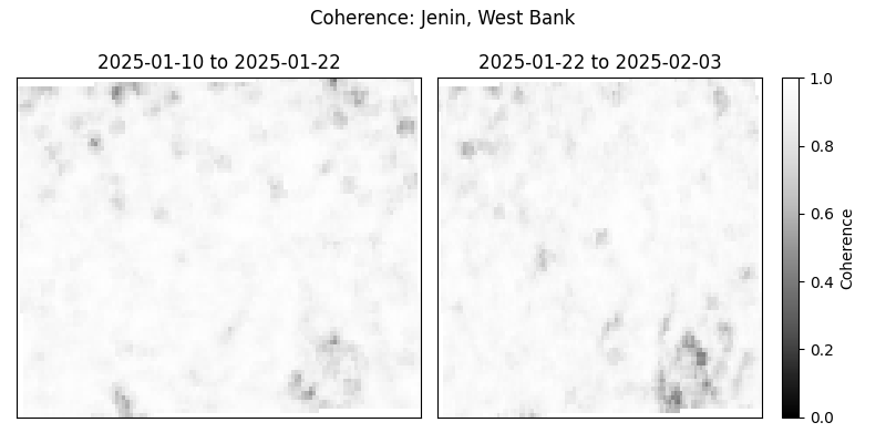
As before, we consider the percentage change in coherence of the image on the right specifically in the regions of high coherence on the left.
aligned = xr.align(data.image[0], data.image[1])
pre = aligned[0]
post = aligned[1]
change = (post - pre) / pre
change = change.where((pre >= 0.9) & (change <= 0))
fig, ax = plt.subplots(1, 1, figsize=(8, 6), sharey=True)
im = change.band_data.plot(ax=ax, vmin=-0.15, vmax=0, levels=5, cmap="Reds_r")
ax.get_xaxis().set_visible(False)
ax.get_yaxis().set_visible(False)
ax.set_title("Change in coherence: Jenin, West Bank\n February 3, 2025")
im.colorbar.set_label("Coherence change (%)")
plt.tight_layout()
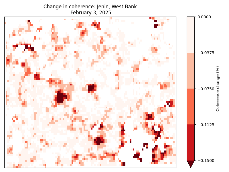
This image suggests significant and widespread damage across Jenin, which is consistent with reporting coming out of the area. At the time of writing, however, I don't have access to any resources for the purpose of cross-referencing so I'll leave it at that. I may look into playing around with any openly available building footprint data if I find the time, and update this note accordingly.
- Weizman, Eyal. Forensic Architecture. Zone Books. Zone Books, 2019.
- Jamaluddine, Zeina, Hanan Abukmail, Sarah Aly, Oona M. R. Campbell, and Francesco Checchi. “Traumatic Injury Mortality in the Gaza Strip from Oct 7, 2023, to June 30, 2024: A Capture–Recapture Analysis.” The Lancet, ahead of print, January 2025. https://doi.org/10.1016/s0140-6736(24)02678-3.
- Geitner, Ryan. “Patterns of Harm Analysis, Gaza, October 2023.” Airwars, December 2023. https://gaza-patterns-harm.airwars.org/.
- Malm, Andreas. “The Destruction of Palestine Is the Destruction of the Earth.” April 8, 2024. https://www.versobooks.com/blogs/news/the-destruction-of-palestine-is-the-destruction-of-the-earth.
- Asi, Yara, David Mills, P. Gregg Greenough, et al. “‘Nowhere and No One Is Safe’: Spatial Analysis of Damage to Critical Civilian Infrastructure in the Gaza Strip during the First Phase of the Israeli Military Campaign, 7 October to 22 November 2023.” Conflict and Health 18, no. 1 (2024). https://doi.org/10.1186/s13031-024-00580-x.
- Podest, Erika. “NASA ARSET: Basics of Synthetic Aperture Radar (SAR), Session 1/4.” Youtube, August 2018. https://www.youtube.com/watch?v=Xemo2ZpduHA.
- Africa Ixmucane Flores-Anderson, Kelsey E. Herndon, Emil Cherrington, et al. The SAR Handbook: Comprehensive Methodologies for Forest Monitoring and Biomass Estimation. 2019. https://doi.org/10.25966/1RGR-Q551.
- Zyl, Jakob van, and Yunjin Kim. Synthetic Aperture Radar Polarimetry. Wiley, 2011. https://doi.org/10.1002/9781118116104.
- King, Michael D., Steven Platnick, W. Paul Menzel, Steven A. Ackerman, and Paul A. Hubanks. “Spatial and Temporal Distribution of Clouds Observed by MODIS Onboard the Terra and Aqua Satellites.” IEEE Transactions on Geoscience and Remote Sensing 51, no. 7 (2013): 3826–52. https://doi.org/10.1109/TGRS.2012.2227333.
- A careful reader might object that side-looking does not prove that no ambiguities can arise. Indeed, the resolution of ambiguities is a non-trivial problem and turns out to pose certain constraints on both hardware and signal processing. For more details, see section 1.6.1 of 8.
- There is also noise due to unwanted microwave radiation picked up by the antenna, e.g. its own blackbody radiation. One particularly amusing one is a signal that's some 13 billion years old: the cosmic microwave background radiation.
- This trick was discovered by Carl Wiley in 1952 at an aerospace/defense subsidiary of the Goodyear tire company that changed hands multiple times and, since 1993, has been owned by Lockheed Martin. Lockheed Martin is the world's largest weapons manufacturer and is one of the many that is profiting from the Zionist genocide in Gaza.
- Note: technically speaking, images are called SLAR images until they've been processed appropriately, after which they're called SAR images.
- "S1 Mission, Observation and Production Scenarios." Accessed January 26, 2025. https://sentiwiki.copernicus.eu/web/s1-mission#S1-Mission-Observation-and-Production-Scenarios.
- The orbit is polar, so the path spacing is considerably denser closer to the poles. Hence Sentinel-1 images regions closer to the poles much more often (about once a day) than regions closer to the equator (about once every three days). Nevertheless, as SAR interferometry requires two SAR images to be taken from almost exactly the same position, we are limited to a time-delta of 12 days when producing InSAR images.
- Polarization is another important aspect of SAR, but I've avoided discussing it here for simplicity.
-
Consider the following back-of-the-envelope calculation. The
surface area of a sphere (an expanding wavefront) scales as the
square of the radius, so we expect the amplitude of the
backscattered wave to be at most
1/(4L^2)times the amplitude of the outgoing wave ifLis the distance from the satellite to the scatterer on the ground. -
There is a technical difficulty in measuring phases: the phase of
a wave that travelled distance
Lis exactly the same as the phase of a wave that travelled distanceL+2*pi. This introduces an ambiguity in data processing. There are a number of sophisticated ways to determine the "unwrapped" phase correctly, known as phase unwrapping algorithms. - Technically speaking, coherence is defined as a moving average of cross-correlation between the before-image and the after-image (in Sentinel-1's case, taken 12 days later), as the averaging window moves across the full image a few pixels at a time.
-
The Vertex UI is a convenient way to riffle through the SAR
images, picking and choosing a few to process and download. This
could be done using the
asf_searchpython package instead, with the processing done via thehyp3_sdkAPI, but for our one-off purposes here, we won't bother with that. Corey Scher, one of the authors of the paper where I first saw this InSAR technique, has some very useful code on his GitHub where you can find a well-documented programmatic approach applied to the case of the urban damage in Aleppo in 2016. - There is an amazing amount of engineering work that goes into getting the Sentinel-1 satellite to almost exactly the same point in orbit repeatedly. As such, there are sometimes technical issues that may affect data quality, and relevant notices can be found on the ASF news site.
- Molavi, Shourideh C. Environmental Warfare in Gaza: Colonial Violence and New Landscapes of Resistance. Pluto Press, 2024. https://doi.org/10.2307/jj.10819588.